Neon_Knight
In the year 3000
  
Cakes 49
Posts: 3775
Trickster God.
|
 |
« Reply #25 on: January 28, 2011, 08:53:23 AM » |
|
Cats vs Dogs idea isn't bad.
Let's put some Testosterone Poisoning in this one: Tigers vs. Bulldogs.  |
|
|
|
|
 Logged
|
 "Detailed" is nice, but if it gets in the way of clarity, it ceases being a nice addition and becomes a problem. - TVT "Detailed" is nice, but if it gets in the way of clarity, it ceases being a nice addition and becomes a problem. - TVT
Want to contribute? Read this. |
|
|
Neon_Knight
In the year 3000
  
Cakes 49
Posts: 3775
Trickster God.
|
 |
« Reply #26 on: January 28, 2011, 09:14:44 AM » |
|
My two cents ideas:
|
|
|
|
« Last Edit: January 28, 2011, 03:16:23 PM by |TXC| Neon_Knight »
|
 Logged
|
 "Detailed" is nice, but if it gets in the way of clarity, it ceases being a nice addition and becomes a problem. - TVT "Detailed" is nice, but if it gets in the way of clarity, it ceases being a nice addition and becomes a problem. - TVT
Want to contribute? Read this. |
|
|
pulchr
Member
Cakes 34
Posts: 625

|
 |
« Reply #27 on: January 28, 2011, 03:31:43 PM » |
|
My two cents ideas:
i like the bulldog. the tiger not so much. imo it would be better if the other team symbol isn't a classic aggressive animal. how about a tortoise, rabbit, dove, alpaca, fish or koala?  |
|
|
|
|
 Logged
|
|
|
|
Cacatoes
Banned for leasing own account
Posts a lot

Cakes 73
Posts: 1427
also banned for baiting another to violate rules
|
 |
« Reply #28 on: January 29, 2011, 08:01:44 AM » |
|
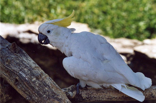
A glimpse on OA Player's bestiary: The Gerbil:  The Hellopacajocketf:  El Cacatoes de la vega:  More I forgot of course, but as you can see, they're not the most typical nor the most agressive ones. Wish these icons could be as imaginative. |
|
|
|
|
 Logged
|
Todo: Walk the cat.
|
|
|
Neon_Knight
In the year 3000
  
Cakes 49
Posts: 3775
Trickster God.
|
 |
« Reply #29 on: January 29, 2011, 08:12:11 AM » |
|
Did some extra examples and also extra versions of those two icons of above. Attached.
BTW, I don't think completely non-aggressive animals can fit in the game.
|
|
|
|
|
 Logged
|
 "Detailed" is nice, but if it gets in the way of clarity, it ceases being a nice addition and becomes a problem. - TVT "Detailed" is nice, but if it gets in the way of clarity, it ceases being a nice addition and becomes a problem. - TVT
Want to contribute? Read this. |
|
|
|
PigCell
Nub
Cakes 2
Posts: 41
|
 |
« Reply #30 on: January 29, 2011, 06:22:22 PM » |
|
Hmmm, maybe I can try my hand at a couple of logos. I'd go for some simpler geometric forms. What do you think about something like round vs. angular? One can be something like a yin-yang or something flowing or tribal, while the other is something a cogwheel, heptagram or some runic symbol.
Artistic idea on the side: Red/Blue is obviously pretty established, but we might also hint at some two-colour standard even with the logo: Red would go well with silver (emblems/heraldic things) while for blue gold might look better as support colour. So each base colour has some metal associated with it that might look nicer in future maps. Orange and blue go well together, after all. For red it's usually green (mouldy/wet stones?) or silver.
I'm still doodling around.
|
|
|
|
|
 Logged
|
|
|
|
Peter Silie
Member
Cakes 2008
Posts: 610
|
 |
« Reply #31 on: January 30, 2011, 01:47:58 AM » |
|
Do not forget a neutral symbol  |
|
|
|
|
 Logged
|
|
|
|
Bane
Member
Cakes 5
Posts: 225
|
 |
« Reply #32 on: January 30, 2011, 06:39:00 AM » |
|
What about a some mean looking skulls for the flag logos
|
|
|
|
|
 Logged
|
|
|
|
Neon_Knight
In the year 3000
  
Cakes 49
Posts: 3775
Trickster God.
|
 |
« Reply #33 on: January 30, 2011, 07:01:11 AM » |
|
What about a some mean looking skulls for the flag logos
Hmm... I don't know, those would be confused by the Harvester skulls. |
|
|
|
|
 Logged
|
 "Detailed" is nice, but if it gets in the way of clarity, it ceases being a nice addition and becomes a problem. - TVT "Detailed" is nice, but if it gets in the way of clarity, it ceases being a nice addition and becomes a problem. - TVT
Want to contribute? Read this. |
|
|
|
PigCell
Nub
Cakes 2
Posts: 41
|
 |
« Reply #34 on: January 30, 2011, 03:52:32 PM » |
|
Here's a test for the background, a sort of stylised 'coat of arms'. The actual logos are supposed to go above those. My plan was to have one in silver and one in gold, but they could even serve as the actual red/blue logos. Okay, they're not that good.
|
|
|
|
|
 Logged
|
|
|
|
Neon_Knight
In the year 3000
  
Cakes 49
Posts: 3775
Trickster God.
|
 |
« Reply #35 on: January 30, 2011, 04:04:27 PM » |
|
I'd go for combining your two ideas with something else.
|
|
|
|
|
 Logged
|
 "Detailed" is nice, but if it gets in the way of clarity, it ceases being a nice addition and becomes a problem. - TVT "Detailed" is nice, but if it gets in the way of clarity, it ceases being a nice addition and becomes a problem. - TVT
Want to contribute? Read this. |
|
|
|
PigCell
Nub
Cakes 2
Posts: 41
|
 |
« Reply #36 on: February 01, 2011, 11:16:02 AM » |
|
Testing an idea for blue ... maybe the background 'coat of arms' needs to go on an actual shield; an abstract one, not a medieval one, of course.
|
|
|
|
|
 Logged
|
|
|
|
Neon_Knight
In the year 3000
  
Cakes 49
Posts: 3775
Trickster God.
|
 |
« Reply #37 on: February 01, 2011, 11:57:59 AM » |
|
Aham... looks fine. I'd go for that.
How the red one would look?
|
|
|
|
|
 Logged
|
 "Detailed" is nice, but if it gets in the way of clarity, it ceases being a nice addition and becomes a problem. - TVT "Detailed" is nice, but if it gets in the way of clarity, it ceases being a nice addition and becomes a problem. - TVT
Want to contribute? Read this. |
|
|
Bane
Member
Cakes 5
Posts: 225
|
 |
« Reply #38 on: February 01, 2011, 05:25:19 PM » |
|
Nice coat of arms Pigcell I like it  |
|
|
|
|
 Logged
|
|
|
|
Neon_Knight
In the year 3000
  
Cakes 49
Posts: 3775
Trickster God.
|
 |
« Reply #39 on: February 01, 2011, 05:44:16 PM » |
|
The idea is to have a blue/yellow and red/green logos for both teams, so these can be used in maps and banners. And then, just the blue and red parts for the projections/decals.
|
|
|
|
|
 Logged
|
 "Detailed" is nice, but if it gets in the way of clarity, it ceases being a nice addition and becomes a problem. - TVT "Detailed" is nice, but if it gets in the way of clarity, it ceases being a nice addition and becomes a problem. - TVT
Want to contribute? Read this. |
|
|
|
PigCell
Nub
Cakes 2
Posts: 41
|
 |
« Reply #40 on: February 02, 2011, 12:38:57 PM » |
|
Those are all just ideas of mine tossed around a bit in gimp. There are two colour themes that go well together that mappers can adjust or ignore all together if they like. That would be the blue-orange and red-green combo that looks pleasing to the eye.
For the logos I went with silver vs. gold (or iron vs. brass or whatever) as secondary colours. Having some metal trim colour associated with each CTF base might help mappers incorporate blue/red surfaces more easily and without looking like crap.
Logo only versions will of course be available, but for now I'm still wrestling with what those logos should actually look like. Same with the backgrounds. Any input (x looks like butt, y is okayish) might help. Or sketch something and scan it in. I'm still learning my way around gimp.
|
|
|
|
|
 Logged
|
|
|
|
Neon_Knight
In the year 3000
  
Cakes 49
Posts: 3775
Trickster God.
|
 |
« Reply #41 on: February 02, 2011, 01:16:20 PM » |
|
Well, I like both of your logos, PigCell, those look awesome, indeed!
|
|
|
|
|
 Logged
|
 "Detailed" is nice, but if it gets in the way of clarity, it ceases being a nice addition and becomes a problem. - TVT "Detailed" is nice, but if it gets in the way of clarity, it ceases being a nice addition and becomes a problem. - TVT
Want to contribute? Read this. |
|
|
Someone_mad
Lesser Nub
Cakes 0
Posts: 102
Painted nails and long haired... I'm not a witch!

|
 |
« Reply #42 on: February 03, 2011, 01:06:54 PM » |
|
I agree with neon knight but, I think the blue/yellow one is not so agreable...
I recommend it more bright colors for the both ones.
I've got no critiques for the red one...
±END¤CONNEXION±
|
|
|
|
|
 Logged
|
|
|
|
Neon_Knight
In the year 3000
  
Cakes 49
Posts: 3775
Trickster God.
|
 |
« Reply #43 on: February 03, 2011, 02:21:44 PM » |
|
I have to do some tests with those icons, to see how those would look in-game.
|
|
|
|
|
 Logged
|
 "Detailed" is nice, but if it gets in the way of clarity, it ceases being a nice addition and becomes a problem. - TVT "Detailed" is nice, but if it gets in the way of clarity, it ceases being a nice addition and becomes a problem. - TVT
Want to contribute? Read this. |
|
|
|
PigCell
Nub
Cakes 2
Posts: 41
|
 |
« Reply #44 on: February 05, 2011, 10:15:10 AM » |
|
I would like to improve these logos a bit, but I don't really know how. So, in case I vanish of the face of the earth or someone wants to fiddle with it, I'll provide the gimp source images. They are layered, so you can edit the original outlines and also get both foreground and background symbols separated.
The .7z contains two gimp .xcf files, one for blue and one for red.
|
|
|
|
|
 Logged
|
|
|
|
Neon_Knight
In the year 3000
  
Cakes 49
Posts: 3775
Trickster God.
|
 |
« Reply #45 on: February 05, 2011, 01:00:31 PM » |
|
To give you an idea, here's how those would look in the form of decals. I have yet to do the flags. The map is this one.     I'll attach a test pk3 when I can do the flag textures (if I can find those among the sources) and remaining logos. |
|
|
|
|
 Logged
|
 "Detailed" is nice, but if it gets in the way of clarity, it ceases being a nice addition and becomes a problem. - TVT "Detailed" is nice, but if it gets in the way of clarity, it ceases being a nice addition and becomes a problem. - TVT
Want to contribute? Read this. |
|
|
|
PigCell
Nub
Cakes 2
Posts: 41
|
 |
« Reply #46 on: February 05, 2011, 01:33:17 PM » |
|
Do tell if you have problems opening those. I might just make an archive with individual .tgas or something.
Ground decals that look like sprayed/painted on the pavement might actually be better as foreground logo only. If you write a shader with the individual layers as separate source textures, you might be able to give the background a metallic reflection effect, like it's supposed to be.
It might even make sense to have 'flat', i.e. unbevelled logos with all effects done inside OA via shaders. Might take some more fiddling, I'll try and write some shaders myself, too.
|
|
|
|
|
 Logged
|
|
|
|
Neon_Knight
In the year 3000
  
Cakes 49
Posts: 3775
Trickster God.
|
 |
« Reply #47 on: February 05, 2011, 01:44:28 PM » |
|
|
|
|
|
|
 Logged
|
 "Detailed" is nice, but if it gets in the way of clarity, it ceases being a nice addition and becomes a problem. - TVT "Detailed" is nice, but if it gets in the way of clarity, it ceases being a nice addition and becomes a problem. - TVT
Want to contribute? Read this. |
|
|
Suicizer
Member
Member

Cakes 2
Posts: 402

|
 |
« Reply #48 on: December 17, 2012, 11:06:34 AM » |
|
What about using the OA symbol within the logo? Would be more obvious than using some different decal.
|
|
|
|
|
 Logged
|
I'm good at everything but can't do anything...
|
|
|
Neon_Knight
In the year 3000
  
Cakes 49
Posts: 3775
Trickster God.
|
 |
« Reply #49 on: January 01, 2013, 09:24:32 PM » |
|
Team symbols exist to give each team something of an own "identity", like these have, for example, in the Threewave CTF maps. I don't think the OA logo alone would work.
|
|
|
|
|
 Logged
|
 "Detailed" is nice, but if it gets in the way of clarity, it ceases being a nice addition and becomes a problem. - TVT "Detailed" is nice, but if it gets in the way of clarity, it ceases being a nice addition and becomes a problem. - TVT
Want to contribute? Read this. |
|
|
|

