kit89
Member
Cakes 6
Posts: 636
Shoot him..
|
 |
« on: March 23, 2008, 07:09:22 AM » |
|
|
|
|
|
« Last Edit: March 23, 2008, 07:14:52 AM by kit89 »
|
 Logged
|
|
|
|
|
fromhell
|
|
« Reply #1 on: March 23, 2008, 09:29:22 PM » |
|
You could have a better choice for a floor texture. That diamond floor doesn't really blend into the theme well
|
|
|
|
|
Logged
|
asking when OA3 will be done won't get OA3 done. Progress of OA3 currently occurs behind closed doors alone I do not provide technical support either.new code development on github |
|
|
kit89
Member
Cakes 6
Posts: 636
Shoot him..
|
|
« Reply #2 on: March 24, 2008, 03:37:21 AM » |
|
Update: Replaced the old diamond floor with a different texture.  http://www.savefile.com/files/1459716 http://www.savefile.com/files/1459716C&C welcomed.  |
|
|
|
« Last Edit: March 24, 2008, 03:39:57 AM by kit89 »
|
Logged
|
|
|
|
cosmo
Member
Cakes 18
Posts: 372
on a dead horse

|
|
« Reply #3 on: March 24, 2008, 03:45:32 AM » |
|
You improved a lot very quickly. Well done kit89. I gave it a short 1on1 against Liz and had much fun. You added fine details. Here are my issues: Strange item/weapon placement. The map plays good at 1on1 but you placed all the stuff for 2on2 or even more players. Why are there 4 Rocketlaunchers and so much ammo? After 5 frags I had 100+ rockets available. Too many armours and health for my taste as well. The room with the quad powerup shines in quality over all the other parts of the map. Is there another possibilty to reach the yellow armors on top of that out of order elevators/storage racks except rocketjumping? I won't go for it because yellow armor is not worth hurting my self that much besides there is is another yellow and red armor in the same room.  Can't wait to see this getting perfect. I love 1on1 maps. |
|
|
|
|
Logged
|
|
|
|
kit89
Member
Cakes 6
Posts: 636
Shoot him..
|
|
« Reply #4 on: March 24, 2008, 04:05:26 AM » |
|
Thanks Cosmo.
I wanted the map to be flexible in the amount of players it can have. I played it with 6 bots and it was great frantic fun & great tactical fun with 1v1.
There's no way to get up to those stacks with out hurting yourself in some way. I may swap some of the items around to encourage/ risking it up there.
|
|
|
|
|
Logged
|
|
|
|
kit89
Member
Cakes 6
Posts: 636
Shoot him..
|
|
« Reply #5 on: March 24, 2008, 05:15:45 AM » |
|
Yet Another Update: Started moving the weapons around to give better balance. Removed a variety of ammo(especially the Rocket Launcher). I placed a Mega health & Combat Armour on the stacks. Removed the Large health. http://www.savefile.com/files/1459819Enjoy! |
|
|
|
|
Logged
|
|
|
|
Snickersnack
Member
Cakes 1
Posts: 196
obnoxious OA fan
|
|
« Reply #6 on: March 24, 2008, 07:54:29 PM » |
|
Neat map Kit. I can see myself getting p0wned here. As far as C&C, I find symetrical maps hard to learn. I'm having a little trouble figuring out which "storage rack" room is which until I hit a jump pad and see either a rail or the two health powerups. I think both rooms currently have red lights. Maybe if one were blue? I like the prominent stairs. They could be a lot of fun dropping grenades down. I appreciate the worthwhile rocket jumps. Ooh, the room with rails is an interesting camping spot! You can rocket jump off the rack onto the ledge near the ceiling. You can walk around almost the entire perimeter of the room. When you finally get spanked, there's megahealth, rails, and rockets to continue annoying people with. |
|
|
|
|
Logged
|
|
|
|
andrewj
Member
Cakes 24
Posts: 584
|
|
« Reply #7 on: March 24, 2008, 10:02:35 PM » |
|
A very nice map that deserves a spot in OA's standard mapset.
Not sure why you call it "Mini", to me this is about normal/best size for 4 player DM.
The biggest problem imo with the lastest beta is the lighting, e.g. the area with the stack and railgun the walls are just Black and raising the gamma (e.g. to 2.0) the floor becomes almost blindingly White. I know q3map2 has lots and lots of options to control lighting (a lot to learn), so I hope you can find the right options to make everything look reasonable, otherwise I suggest use a brighter wall texture or dimmer floor texture.
|
|
|
|
|
Logged
|
|
|
|
|
whitewolf
|
|
« Reply #8 on: March 25, 2008, 06:53:14 AM » |
|
Looking good. I would suggest that you lower the floating structure with the lights so that it is more prominent. People dont always see things that are above their eye level; I only saw it because I rememberred it from the screenshot.
|
|
|
|
|
Logged
|
|
|
|
kit89
Member
Cakes 6
Posts: 636
Shoot him..
|
|
« Reply #9 on: March 25, 2008, 11:57:03 AM » |
|
the area with the stack and railgun the walls are just Black and raising the gamma (e.g. to 2.0) the floor becomes almost blindingly White. I'll go around the rail & stack walls and lighten them up slightly. Glad everyone is liking the map.  |
|
|
|
« Last Edit: March 25, 2008, 12:18:57 PM by kit89 »
|
Logged
|
|
|
|
kit89
Member
Cakes 6
Posts: 636
Shoot him..
|
|
« Reply #10 on: March 25, 2008, 01:03:22 PM » |
|
Update: Added lights around the areas that where black/really dark. Lowered the floating light structure. Making it slightly more noticeable. http://www.savefile.com/files/1463013Enjoy! |
|
|
|
|
Logged
|
|
|
|
kit89
Member
Cakes 6
Posts: 636
Shoot him..
|
|
« Reply #11 on: March 26, 2008, 02:56:47 PM » |
|
Update: Improved lighting, was still getting told it was too dark. So I made it even brighter. Thanks Enki for helping out in that area! http://www.savefile.com/files/1465162Enjoy. |
|
|
|
|
Logged
|
|
|
|
kit89
Member
Cakes 6
Posts: 636
Shoot him..
|
|
« Reply #12 on: April 04, 2008, 12:44:41 PM » |
|
Update: Added some details to the more bearer parts of the map, And some more lights. http://www.savefile.com/files/1484136 |
|
|
|
« Last Edit: April 04, 2008, 12:48:52 PM by kit89 »
|
Logged
|
|
|
|
kit89
Member
Cakes 6
Posts: 636
Shoot him..
|
|
« Reply #13 on: April 04, 2008, 03:19:52 PM » |
|
Hopefully the final update. I reduced the ambient light and added in larger lights, to give each section a colour. The Two large areas at either side, one uses yellow lights the other orange. http://www.savefile.com/files/1484312C&C welcomed. |
|
|
|
|
Logged
|
|
|
|
andrewj
Member
Cakes 24
Posts: 584
|
|
« Reply #14 on: April 04, 2008, 07:05:28 PM » |
|
Floors in outdoor areas still seem way too bright to me. I suggest using a lower -sky parameter to q3map2, maybe -sky 0.3 or so. (I had the same problem with my own map, and I disabled it completely with -sky 0.0, and instead added some large lights near the sky ceilings). The plasma gun placement is a bit awkward imo, too close to the edge. There is a large plain wall above one of the ramps (the wall above the other ramp has a light), and that would be a good place for an OA banner Hope that helps. |
|
|
|
|
Logged
|
|
|
|
Snickersnack
Member
Cakes 1
Posts: 196
obnoxious OA fan
|
|
« Reply #15 on: April 04, 2008, 08:06:25 PM » |
|
Looking good kit89! I shouldn't have copied over the old ones. Everything looks prettier for some reason but I can't place it. I would suggest adding some marker to the megahealth or red armor rooms so that they're easier to distinguish from the ground. It's not a big deal normally, but if I'm getting stomped, well ... I need all the help I can get. A pit under the Quad damage might be fun. |
|
|
|
|
Logged
|
|
|
|
kit89
Member
Cakes 6
Posts: 636
Shoot him..
|
|
« Reply #16 on: April 05, 2008, 12:46:17 PM » |
|
Okay added in a tonne of stuff, made some modification here & there to some of the details and added new ones in. I also fiddled with the lighting a bit more, so that looks pretty damn good. The ramp now cast shadows! I found out that patches by default don't cast shadows. C&C welcomed. http://www.savefile.com/files/1486108 |
|
|
|
|
Logged
|
|
|
|
cosmo
Member
Cakes 18
Posts: 372
on a dead horse
|
|
« Reply #17 on: April 07, 2008, 02:31:05 AM » |
|
Looks way better now.
You should try adding "-dirty" to your light compilestep if you didn't test that yet. Your corners and narrow places will become a bit darker.
|
|
|
|
|
Logged
|
|
|
|
andrewj
Member
Cakes 24
Posts: 584
|
|
« Reply #18 on: April 07, 2008, 09:25:18 PM » |
|
Yep, lighting has improved a lot. One last architectural thing that doesn't look good imo, where the skirting just stops: 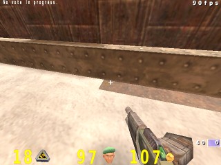 |
|
|
|
|
Logged
|
|
|
|
kit89
Member
Cakes 6
Posts: 636
Shoot him..
|
|
« Reply #19 on: April 08, 2008, 05:10:31 PM » |
|
You should try adding "-dirty" to your light compilestep if you didn't test that yet. Your corners and narrow places will become a bit darker. Thanks for the tip, I'll do a test tomorrow. See if it adds to the map. I'll modify the map so the edge doesn't stop suddenly. After that I'll be committing him. |
|
|
|
|
Logged
|
|
|
|
kit89
Member
Cakes 6
Posts: 636
Shoot him..
|
|
« Reply #20 on: April 09, 2008, 05:49:38 AM » |
|
|
|
|
|
|
Logged
|
|
|
|
andrewj
Member
Cakes 24
Posts: 584
|
|
« Reply #21 on: April 09, 2008, 09:32:28 AM » |
|
Congrats! Finishing something is often harder than starting it |
|
|
|
|
Logged
|
|
|
|
|
|
sago007
Posts a lot

Cakes 62
Posts: 1664
Open Arena Developer
|
|
« Reply #23 on: May 24, 2008, 10:36:09 AM » |
|
The same is possible in dm4ish |
|
|
|
|
Logged
|
There are nothing offending in my posts.
|
|
|
kit89
Member
Cakes 6
Posts: 636
Shoot him..
|
|
« Reply #24 on: July 15, 2008, 04:30:37 PM » |
|
Decided Mini Arena needed a bit of an update. I had sudden inspiration to remove the stacks replacing them with floating platforms. Overall the modifications I made adds & improves gameplay imo. - Removed the Stacks - Added floating platforms - Moved certain items around - Added more detail around the map - Fixed bug with flags. -Added changed gradients of certain areas. -Added jump pads to floating platforms instead of rocket jumping, should encourage some interesting Z-axis fragging. - Improved lighting    Here's a .pk3 for those that want to test: http://linxonline.co.uk/dev/OA/minia_dev.pk3To run, type in the console: /devmap minia C&C welcome. Enjoy! |
|
|
|
|
Logged
|
|
|
|
|
