Udi
Member
Cakes 25
Posts: 536
i do my own stunts

|
 |
« on: June 25, 2009, 04:45:30 AM » |
|
I'm opening a new topic for fonts. There was a discussion in the suggestions for openarena topic, but I think it's a better place to talk about fonts. Schlorri remade the original OpenArena font to be sharper (pulchr's screenshot): 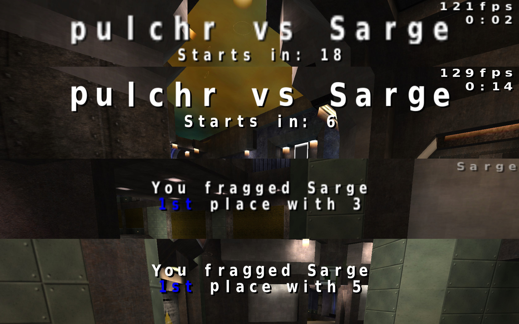 And I asked Schlorri to make the font more like the OpenArena logo. He showed me a serif like font which resembles the original OA logo more. 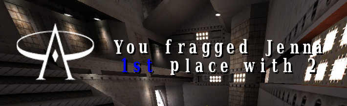 But I meant the new logo, which was made by Joshua and it is used in the official homepage redesign. I strongly believe that the next OpenArena version should entirely follow this modern, cool, blueish design. So I was thinking about a font which resembles the new OA logo. 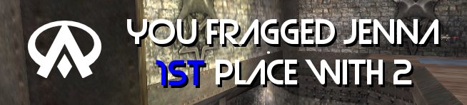 This picture is not ingame, it's only a showcase done with GIMP. The font is the Strasua font, which ain't GPL so you shouldn't copy that. I only presented because it somewhat looks like the new logo. I think the new font should more or less look like the Strasua font, but it should be an entirely new font from scratch with the following features: it should be wide, somewhat bold, the font lines should be simple, more sans than serif, there should be some curves, not entirely sharp corners, all characters should be easily recognisable even if the text is small (the A and W in the Strasua font are a bit hard to read), maybe some letters can be unique (A with a diamond like in the logo). |
|
|
|
|
 Logged
|
|
|
|
|
fromhell
|
|
« Reply #1 on: June 25, 2009, 04:47:19 AM » |
|
The problem with hi-res font textures, they'll thrash all the older chipsets and also don't scale down too well (tons of pixel popping in the console)
|
|
|
|
|
Logged
|
asking when OA3 will be done won't get OA3 done. Progress of OA3 currently occurs behind closed doors alone I do not provide technical support either.new code development on github |
|
|
schlorri
i lurk the board index every minute!!!!
Lesser Nub
Cakes -51
Posts: 149
|
|
« Reply #2 on: June 25, 2009, 04:53:06 AM » |
|
The problem with hi-res font textures, they'll thrash all the older chipsets and also don't scale down too well (tons of pixel popping in the console)
Not a big problem, we could add a cvar for hqfonts. Udi: a this one u mean  , this would look better! |
|
|
|
|
Logged
|
|
|
|
Graion Dilach
Member
Cakes 12
Posts: 403
|
|
« Reply #3 on: June 25, 2009, 04:57:36 AM » |
|
Well... I have a suggestion. What about a Larabie font? For example; this. http://new.myfonts.com/fonts/larabie/good-times/Most Larabie fonts are added to OpenOffice downloads, that's why I started checking them. |
|
|
|
|
Logged
|
One shall remind what have he left behind... to actually realize that it's still cool.
|
|
|
schlorri
i lurk the board index every minute!!!!
Lesser Nub
Cakes -51
Posts: 149
|
|
« Reply #4 on: June 25, 2009, 05:07:18 AM » |
|
Would look good, but i can not find any Larabie-GPL-fonts. You know a site? |
|
|
|
|
Logged
|
|
|
|
Graion Dilach
Member
Cakes 12
Posts: 403
|
|
« Reply #5 on: June 25, 2009, 05:24:17 AM » |
|
Oops... true. Even I remembered it wrong about having it in OOo.
Forget it.
|
|
|
|
|
Logged
|
One shall remind what have he left behind... to actually realize that it's still cool.
|
|
|
Udi
Member
Cakes 25
Posts: 536
i do my own stunts
|
|
« Reply #6 on: June 25, 2009, 03:57:48 PM » |
|
I figured out something about how the engine renders the fonts. The key is that all the important vertical lines should begin on odd pixels (1st, 3rd, 5th pixel from the left). See the picture:  The horizontal position doesn't seem to influence the result, but the vertical position does indeed! Compare the pictures from the console: On the first all the characters are on even pixels, the result is blurry, unreadable:  On the second all the characters are on the odd pixels, the result is nice, sharp bitmap fonts:  On the third you can see the original font in the console. Not all the characters are blurry but some could be more sharp:  And you can compare the test font and the original ingame: test font vs. original. I think we can achieve pretty good results without introducing a hqchars variable just with the usual 256x256 tga. This font is for testing only, but it has all the characters redrawn, it can be a pretty good starting point. You can download the source package, it contains the Inkscape SVG, the GIMP XCF (used for conversion only) and the pk3 for testing (you should copy it into oa/baseoa). Everything is GPL v2. |
|
|
|
|
Logged
|
|
|
|
Udi
Member
Cakes 25
Posts: 536
i do my own stunts
|
|
« Reply #7 on: July 13, 2009, 07:11:35 AM » |
|
I've managed to complete the first set of characters, and redraw all the fonts found in OA (except for buttons and other embedded images). The funny thing is, that while bigchars.tga contains monospaced characters, the other two (font1_prop, font2_prop) contain custom width characters, so the fonts made for bigchars are a bit distorted, but it can be improved. All my sources still needs polishment, but I want to show them before I put too much effort into fonts that no one will like . Here are some before/after screenshots (sorry for the jpg noise): Console and chat fonts:  Frag message:  Multiplayer window:  Options window:  Here's the package for testing yourself: z_oafont_udi_0.1.pk3 (put it into baseoa). And here go the sources: oafont_udi_0.1_sources.zip. The source package contains all the SVGs, XCFs, a small readme where to find things, a changelog with some more todos, and of course the GPL v2 license. If you don't like the fonts, my sources are still worth downloading, because there are grids for font1_prop and font2_prop which are essential (even some original fonts are off the grid). And I found a font1_prop_glow.tga in the OA packages, I think it is superfluous, there's the real file next to it called font1_prop_glo.tga. Any feedback is welcome. |
|
|
|
|
Logged
|
|
|
|
schlorri
i lurk the board index every minute!!!!
Lesser Nub
Cakes -51
Posts: 149
|
|
« Reply #8 on: July 13, 2009, 07:35:00 AM » |
|
Hello,
ive tested it a bit: GREAT WORK! The HUD looks better, fragmsg looks better .... everything looks better.
I hope this font will find its way in openarena!
|
|
|
|
|
Logged
|
|
|
|
andrewj
Member
Cakes 24
Posts: 584
|
|
« Reply #9 on: July 13, 2009, 07:45:55 AM » |
|
That new font looks excellent.
The 'm' seems a bit narrow, but I'm guessing the "odd rule" you discovered prevents making it wider.
|
|
|
|
|
Logged
|
|
|
|
|
fromhell
|
|
« Reply #10 on: July 13, 2009, 10:20:57 AM » |
|
I like this font
|
|
|
|
|
Logged
|
asking when OA3 will be done won't get OA3 done. Progress of OA3 currently occurs behind closed doors alone I do not provide technical support either.new code development on github |
|
|
cosmo
Member
Cakes 18
Posts: 372
on a dead horse
|
|
« Reply #11 on: July 13, 2009, 10:25:01 AM » |
|
You did a big improvement.
Coming from human-computer interaction I like the new sharpness but dislike the type of font you have chosen. It is harder to recognize the new letters. I'd prefer a more standardized, easy readable font. Just my personal taste...
|
|
|
|
|
Logged
|
|
|
|
Udi
Member
Cakes 25
Posts: 536
i do my own stunts
|
|
« Reply #12 on: July 15, 2009, 11:36:31 AM » |
|
Thanks for the replies, I will go trough all the characters and see if it can be more legible.
|
|
|
|
|
Logged
|
|
|
|
chaoticsoldier
Member
Cakes 18
Posts: 375
This space intentionally left blank.
|
|
« Reply #13 on: July 16, 2009, 06:03:34 AM » |
|
The only thing I dislike about this font is the line through the 7.
I think it looks great in the menus, but I'm not sure it suits the scoreboard and the HUD and the console.
|
|
|
|
|
Logged
|
0101100101101111011101010010011101110110011001010010000001101010011101010111001101110100001000000111011101100001011100110111010001100101011001000010000001111001011011110111010101110010001000000111010001101001011011010110010100101110
|
|
|
Udi
Member
Cakes 25
Posts: 536
i do my own stunts
|
|
« Reply #14 on: July 16, 2009, 09:27:09 AM » |
|
The only thing I dislike about this font is the line through the 7.
As you mention it: my native English teacher talked about that differences between the British and Continental numbers. As a Central-European I didn't realised it is unnecessary, I will remove it. |
|
|
|
|
Logged
|
|
|
|
pulchr
Member
Cakes 34
Posts: 625
|
|
« Reply #15 on: July 16, 2009, 09:37:02 AM » |
|
i usually write my sevens with a dash, but i agree with chaotic here, it looks a bit strange.
but apart from that i think it looks nice. especially the sharp edges.
|
|
|
|
|
Logged
|
|
|
|
sago007
Posts a lot

Cakes 62
Posts: 1664
Open Arena Developer
|
|
« Reply #16 on: July 18, 2009, 06:26:23 AM » |
|
I really don't like the square fonts. They are sorta 1980ish in style from a time that computers could not display nice fonts.
Fonts should be soft edged and easy on the eyes. The main purpose of the fonts is to give information. I can read the messages in OpenArena with no problem but I know what it says. I have seen the same style fonts used in other games and I found it really bad and hard to read as I did not know what the message was.
My opinions is based on the screenshots only.
|
|
|
|
|
Logged
|
There are nothing offending in my posts.
|
|
|
pulchr
Member
Cakes 34
Posts: 625
|
|
« Reply #17 on: July 18, 2009, 07:59:13 AM » |
|
the old font is better in the console while the 'new' is better suited in the large texts display in-game.
the contrast seems to be higher in the new font? or is it just the sharp edges?
|
|
|
|
|
Logged
|
|
|
|
Udi
Member
Cakes 25
Posts: 536
i do my own stunts
|
|
« Reply #18 on: July 18, 2009, 11:49:07 AM » |
|
I really don't like the square fonts. They are sorta 1980ish in style from a time that computers could not display nice fonts.
Well, since in the bigchars.tga all the characters should fit into 16x16 pixels it is really like in the 80'. I'm working on more recognizable fonts, the next version will come soon. the contrast seems to be higher in the new font? or is it just the sharp edges?
It is the sharp edges, in the original fonts all the characters have some semi-transparent pixels around which makes it look like smooth (some kind of anti-aliasing). The problem is that the bigger characters contain the same semi-transparent noise, that makes the bigger text look ugly. So my idea was to get rid of as much faulty pixels as possible (that's why the characters are square like). Schlorri suggested another solution to introduce a c_var, and use a 256x256 tga for console and a 1024x1024 tga for the bigger fonts (since the high resolution font looks also crappy on the console). And Falkland suggested we use the Freetype support in ioquake3. |
|
|
|
|
Logged
|
|
|
|
|
steauengeglase
|
|
« Reply #19 on: July 18, 2009, 04:24:53 PM » |
|
I really don't like the square fonts. They are sorta 1980ish in style from a time that computers could not display nice fonts. I dunno, it kinda adds a bit of coolness to it, the retro flair I mean. OA could use a few stylish makeovers, give it a little of its own personality. |
|
|
|
|
Logged
|
|
|
|
Udi
Member
Cakes 25
Posts: 536
i do my own stunts
|
|
« Reply #20 on: July 19, 2009, 06:35:54 AM » |
|
I release the next version before going on holidays. There's not much to tell, everything is more polished. Botchat and console (left = v0.1, right = v0.2):  Fragmessage (from top to bottom: original, v0.1, v0.2):  Tournament message (from top to bottom: original, v0.1, v0.2):  On the console picture you can see that it is slightly modified, I think it can be read easier but I cannot judge it, I'm too much used to it. The tournament screenshots were missing before, but it is the most problematic font because of its size. 0.2 contains bigger curves, so it will get ugly on that. I think the XY vs. VZ text should be decreased in the engine itself, it is impossible to present satisfying results for small texts like the console and for large texts like the tournament message. Package: z_oafont_udi_0.2.pk3Sources: oafont_udi_0.2_sources.zip |
|
|
|
|
Logged
|
|
|
|
Neon_Knight
In the year 3000
Cakes 49
Posts: 3775
Trickster God.
|
|
« Reply #21 on: July 19, 2009, 08:28:26 AM » |
|
Yep, these are very different.
I should try these when I have some time between the mapping and my duties.
|
|
|
|
|
Logged
|
 "Detailed" is nice, but if it gets in the way of clarity, it ceases being a nice addition and becomes a problem. - TVT "Detailed" is nice, but if it gets in the way of clarity, it ceases being a nice addition and becomes a problem. - TVT
Want to contribute? Read this. |
|
|
Udi
Member
Cakes 25
Posts: 536
i do my own stunts
|
|
« Reply #22 on: July 27, 2009, 07:04:51 AM » |
|
Another experiment with fonts (playing with Portal boosts my brain activity ). I started a new font based on the Liberation Sans font, which is also GPL. Here are the results compared to the original font: original console vs. new sans console:  original tournament vs. new sans tournament:  You can see that the sans font is easily readable but because of the curves and diagonal lines it is almost as ugly as the original font if it gets scaled. And here came my idea: Schlorri's high definition font looked ugly in the console, because certain pixels get omitted, maybe this can be solved with the odd rule described in a previous post. Here are the results: console (from top to bottom: Schlorri's font (1024x1024 tga), new sans at 1024x1024 tga, new sans at 512x512 tga):  tournament (from top to bottom: Schlorri's font (1024x1024 tga), new sans at 1024x1024 tga, new sans at 512x512 tga):  The question is whether we can use 512x512 resolution for the bigchars.tga (I don't think we need bigger than that). Sources and testing packages next time . |
|
|
|
|
Logged
|
|
|
|
schlorri
i lurk the board index every minute!!!!
Lesser Nub
Cakes -51
Posts: 149
|
|
« Reply #23 on: July 27, 2009, 08:32:24 AM » |
|
First i want to say : i like your first self created font more :-) ! So now the resolution Question: In my opinion the goal is not make the font look less crappy, the goal is to make the font look NOT crappy anymore -> so we need high-resolution-tgas. I think a good idea is to make the cgs.media.charsetShader r_mode dependent, so users with high resolution will load an high-res bigchar ... GIANT_HEIGHT is 48 px on 640x480 and it look bad already, because we use an 16px/char charset . You can calculate your real GIANT charheight with 0.1px*screenres_height, in my case 108px ...compared to 16px it looks a bit scary. So lets look with "trap_Cvar_VariableValue( "r_mode" )" the screenres (r_mode = -1 -> r_customheight ) and register the charset screenres dependent. schlorri |
|
|
|
|
Logged
|
|
|
|
Udi
Member
Cakes 25
Posts: 536
i do my own stunts
|
|
« Reply #24 on: July 27, 2009, 12:47:45 PM » |
|
I don't know if we can introduce such calculations because of compatibility issues. But if we can change the code, than I think it's easier to separate the console, botchat and the frag message, tournament message font. The first two fonts have 18 pixel height on 1280x800 pixel resolution in game, so nearly the same as in the 256x256 big tga. But the tournament message fonts are nearly 74 pixel high in the game, which is 400% bigger (even in the 1024x1024 big tga you only have 64 pixels for a single character). No matter how you calculate which resolution to use, you will have a huge gap between the small and big characters.
|
|
|
|
|
Logged
|
|
|
|
|
