schlorri
i lurk the board index every minute!!!!
Lesser Nub
Cakes -51
Posts: 149

|
 |
« Reply #25 on: July 27, 2009, 02:51:16 PM » |
|
I don't know if we can introduce such calculations because of compatibility issues. But if we can change the code, than I think it's easier to separate the console, botchat and the frag message, tournament message font. The first two fonts have 18 pixel height on 1280x800 pixel resolution in game, so nearly the same as in the 256x256 big tga. But the tournament message fonts are nearly 74 pixel high in the game, which is 400% bigger (even in the 1024x1024 big tga you only have 64 pixels for a single character). No matter how you calculate which resolution to use, you will have a huge gap between the small and big characters.
ok better idea ... not resolution dependent -> i can implement it charsize dependent in function CG_DrawChar( int x, int y, int width, int height, int ch ). So we dont have to seperate several messages. |
|
|
|
|
 Logged
|
|
|
|
schlorri
i lurk the board index every minute!!!!
Lesser Nub
Cakes -51
Posts: 149
|
|
« Reply #26 on: July 27, 2009, 08:17:12 PM » |
|
Ok done, modified CG_DrawChar ... there is a test how high the char is on screen (in px), then the right charset is choosen -> no scary chars anymore  |
|
|
|
|
Logged
|
|
|
|
schlorri
i lurk the board index every minute!!!!
Lesser Nub
Cakes -51
Posts: 149
|
|
« Reply #27 on: July 27, 2009, 08:25:58 PM » |
|
As you can see here it is sharp on 640x480 too (sorry...i can only upload 1024 kb per post  ) |
|
|
|
|
Logged
|
|
|
|
pulchr
Member
Cakes 34
Posts: 625
|
|
« Reply #28 on: July 27, 2009, 08:36:52 PM » |
|
looks very good!
|
|
|
|
|
Logged
|
|
|
|
Cacatoes
Banned for leasing own account
Posts a lot

Cakes 73
Posts: 1427
also banned for baiting another to violate rules
|
|
« Reply #29 on: August 12, 2009, 11:02:19 AM » |
|
I'm using z_oafont_udi_0.2. 8 and B look the same ... It gave the game a fresh look, but the excitment passed I don't know what to think about that font  Except the 8 and B problem, I hadn't any issue to read it correctly. |
|
|
|
|
Logged
|
Todo: Walk the cat.
|
|
|
Udi
Member
Cakes 25
Posts: 536
i do my own stunts
|
|
« Reply #30 on: August 12, 2009, 11:10:37 AM » |
|
New releases will come soon. The square like version is ready actually, but I want to release a Liberation Sans based one at the same time, so testers won't be tired of new fonts coming out every week . |
|
|
|
|
Logged
|
|
|
|
Udi
Member
Cakes 25
Posts: 536
i do my own stunts
|
|
« Reply #31 on: August 20, 2009, 12:48:16 PM » |
|
Release time  ! There are two major improvements in the new versions. The first is narrower lowercase letters and narrower numbers. With narrower letters there's more whitespace which helps the mind recognizing the characters, no more endless heap of lines. Because all the lowercase letters were shrink, the relative size of the 'm' is increased, it doesn't looks so small compared to the others. Since the numbers are narrow too, 8 and B can be more easily distinguished. The other improvement is a small bash script which converts the Inkscape exported number png-s straight to 3D looking tga-s with the help of Image Magick. No more applying effects with Gimp to all the numbers (11 of them), it speeds up testing and releasing. The bash script is in both source files, it is well commented and you can also read about it in the readme. In general both fonts are well polished, every string found in the game was checked to look good. I'm quite satisfied with them, so I will move on to something different, maybe textures or other GUI things. But first the fonts: Digit v0.3I've named the previous font Digit, so it's easier to refer to it. Version 0.3 is more resembling the 0.1 version, it contains less curves than 0.2, so it looks more smooth, and because of the narrowing described above it can be more easily read than 0.2. The screenshots compare 0.1 and 0.3: Console and botchat (left: 0.1, right 0.3)  Frag message (top: 0.1, bottom: 0.3)  Tournament message (top: 0.1, bottom: 0.3)  0.3 was kind of finished two weeks ago, and since then I used to the sans font. Today I put this back, and it hit me like "WTF"! It felt totally new, but I got used to pretty fast, so I think it's readable enough to go into SVN. But I'm a wrong judge, so please tell me your opinion about it! Package for instant testing: z_oafont_digit_0.3.pk3 (just put it into baseoa) Sources: oafont_digit_0.3_sources.zip (GPLv2) Sans v0.1I've named it sans because it's based on Liberation Sans. But the font2_prop is made sans-serif like in the OA font. After all the characters were drawn, some characters were freely modified without any reference to Liberation Sans to look good in the console. Console and botchat (left: OA, right: sans 0.1)  Frag message (top: OA, bottom: sans 0.1) 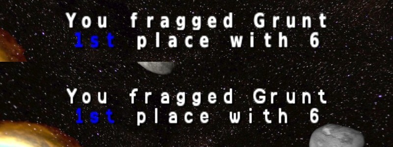 Tournament message (top: OA, bottom: sans 0.1) 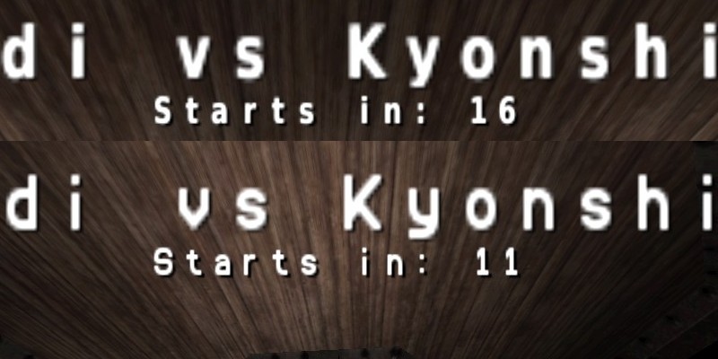 And here comes the real power of the bash script mentioned earlier. With the help of it you can apply any effect to all the numbers in no time, so playing with the numbers is easy. I made a wider version of the numbers (the normal version is in the sources too), just like Q3 numbers were, and added a brushed metal texture to it. The texture was made with some stock Gimp effects (xfc also in the sources). Here's the result: 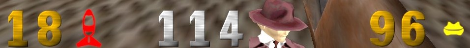 I think it looks cool, but you can comment out the texture line in the bash script, and you will find the narrow numbers in the sources, rebuilding the numbers is some text editing and one double click away . You can see on the previous pictures that the sans 0.1 renders a little better than the OA font, and because it's actually a standard sans font, no bad words can be said on the readabilty. If Digit 0.3 is not good enough, than sans 0.1 should definitely go to SVN, because it fixes some bugs too (top: OA, bottom 0.1, characters above: []@./\): 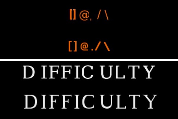 Package for instant testing: z_oafont_sans_0.1.pk3 (just put it into baseoa) Sources: oafont_sans_0.1_sources.zip (GPLv2) So the question is: which font should be the next OA font? Any other suggestions are also welcome . |
|
|
|
|
Logged
|
|
|
|
Graion Dilach
Member
Cakes 12
Posts: 403
|
|
« Reply #32 on: August 20, 2009, 01:48:13 PM » |
|
One vote for Digit... except that upper curve of the 'c'.
That gives me nightmares... or just simply looks ugly.
|
|
|
|
|
Logged
|
One shall remind what have he left behind... to actually realize that it's still cool.
|
|
|
|
|
Graion Dilach
Member
Cakes 12
Posts: 403
|
|
« Reply #34 on: September 04, 2009, 02:24:20 PM » |
|
Great!
Now I particularly support that Digit...
Nice job, Udi.
|
|
|
|
|
Logged
|
One shall remind what have he left behind... to actually realize that it's still cool.
|
|
|
|
Marble of Doom
Bigger member
Cakes 4
Posts: 151
Caketastic
|
|
« Reply #35 on: September 04, 2009, 04:23:34 PM » |
|
New version looks great!
|
|
|
|
|
Logged
|
|
|
|
Udi
Member
Cakes 25
Posts: 536
i do my own stunts
|
|
« Reply #36 on: September 07, 2009, 12:56:55 PM » |
|
Thanks for the replies ! As I was doing the 2D improvement package I've got the idea setting the transparency against black instead setting it against white. Here's the result: 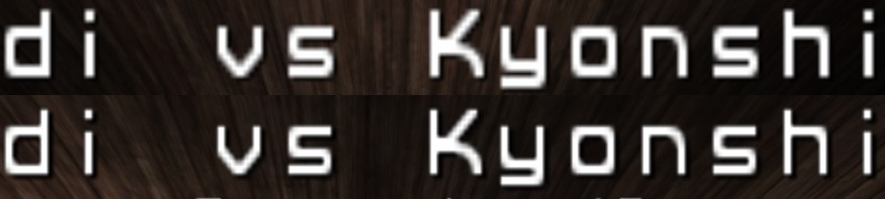 As you can see it got narrower because the semi-transparent pixels which are causing the blurry edges are now much darker. This technique was applied to the sans font released in the 2D improvement package, so here's digit version 0.3.2 with the same technique: Package: http://udionline.hu/fajlok/z_oafont_digit_0.3.2.pk3Sources: http://udionline.hu/fajlok/oafont_digit_0.3.2_sources.zip |
|
|
|
|
Logged
|
|
|
|
00Hugo00
Nub
Cakes 1
Posts: 35
|
|
« Reply #37 on: November 13, 2009, 11:47:35 AM » |
|
yes, but...
How can i make a font ?
TTF2Font works ?
|
|
|
|
|
Logged
|
00Hugo00 : - p
|
|
|
Udi
Member
Cakes 25
Posts: 536
i do my own stunts
|
|
« Reply #38 on: November 14, 2009, 04:00:27 AM » |
|
How can i make a font ?
TTF2Font works ?
No, TTF2Font is for the Cube engine, and the Cube engine's and ioQuake3's font bitmaps are different. I suggest you download my latest source package, there are .SVG files. You can open them with Inkscape which is opensource and free and cool, and there you can place your font one by one into the grid I drew. |
|
|
|
|
Logged
|
|
|
|
|
hkn
|
|
« Reply #39 on: December 15, 2009, 11:03:53 AM » |
|
Hi people! This is mi first post, i'm new here. I've been working on new HUD numbers and new in-game font. The font is called "HeadlineNEWS" and it's licensed in public domain at http://www.fontspace.com/reference-type-foundry/headlinenews   And fullscreen screenshot  I attached the .pk3 file, if anyone want to test it. Im Spanish actually, so my english isn't very good bb! |
|
|
|
|
Logged
|
ToDo >> / 1. New map, Greyscale / 2. Mapmodels / 3. New weapons / 4. In-game music
|
|
|
Udi
Member
Cakes 25
Posts: 536
i do my own stunts
|
|
« Reply #40 on: December 15, 2009, 12:41:04 PM » |
|
Hi people!
This is mi first post, i'm new here.
Hi, and welcome to the forums ! Your original font looks nice, glad it's public domain. But when porting it to the ioquake3 engine as a bitmap, pay attention that it has no anti aliasing. Your bigchars.tga has a resolution of 1024x1024 pixels, and thus it looks great on high resolution and big text. But on the console it is scaled down, and because it lacks antialiasing it will look rough on the edges. Here's a comparison, on the left HeadlineNEWS, on the right the 0.8.5 fonts.  Try rescaling the bigchars.tga to 512x512 or 256x256 pixels, maybe you will find the best result. Your package contains a lot of unnecessary images, for the fonts you only need: - gfx/2d/bigchars.tga
- gfx/2d/numbers/*
- menu/art/font1_prop.tga
- menu/art/font1_prop_glo.tga
- menu/art/font2_prop.tga
The weight of your fonts is closer to the original Q3 bold font and the lower uppercase letters are not a bad idea either. Keep up the good work! Oh, and don't forget to submit your font to the Open Font Library ! |
|
|
|
|
Logged
|
|
|
|
|
Falkland
Member
Cakes 6
Posts: 590
|
|
« Reply #41 on: December 15, 2009, 01:22:10 PM » |
|
Freetype support + customizable hud like CPMA SuperHud could have been the best solution ...
|
|
|
|
|
Logged
|
|
|
|
|
hkn
|
|
« Reply #42 on: December 15, 2009, 01:55:44 PM » |
|
Hi people!
This is mi first post, i'm new here.
Hi, and welcome to the forums ! Your original font looks nice, glad it's public domain. But when porting it to the ioquake3 engine as a bitmap, pay attention that it has no anti aliasing. Your bigchars.tga has a resolution of 1024x1024 pixels, and thus it looks great on high resolution and big text. But on the console it is scaled down, and because it lacks antialiasing it will look rough on the edges. Here's a comparison, on the left HeadlineNEWS, on the right the 0.8.5 fonts. Try rescaling the bigchars.tga to 512x512 or 256x256 pixels, maybe you will find the best result. Your package contains a lot of unnecessary images, for the fonts you only need: - gfx/2d/bigchars.tga
- gfx/2d/numbers/*
- menu/art/font1_prop.tga
- menu/art/font1_prop_glo.tga
- menu/art/font2_prop.tga
The weight of your fonts is closer to the original Q3 bold font and the lower uppercase letters are not a bad idea either. Keep up the good work! Oh, and don't forget to submit your font to the Open Font Library ! The font that i used is not created by me, i dicovered searching deeply, that has been created in 1994 by Albert J.Kim (google dont have much information about this guy). So i'm gonna use a really open font, discarding this font. Seems ridiculous that one font can have copyright... but this is another topic (or flame). Sorry for the misunderstanding |
|
|
|
|
Logged
|
ToDo >> / 1. New map, Greyscale / 2. Mapmodels / 3. New weapons / 4. In-game music
|
|
|
Udi
Member
Cakes 25
Posts: 536
i do my own stunts
|
|
« Reply #43 on: December 15, 2009, 02:04:59 PM » |
|
So i'm gonna use a really open font, discarding this font.
Seems ridiculous that one font can have copyright... but this is another topic (or flame).
No! You can use this font, it's public domain, so go ahead and use it ! Freetype support + customizable hud like CPMA SuperHud could have been the best solution ...
Yes, but OA aims for a 100% mod compatibility, so we need some vanilla Q3 tga fonts. Whether we use them or not thats another question. |
|
|
|
|
Logged
|
|
|
|
|
hkn
|
|
« Reply #44 on: December 17, 2009, 07:37:10 PM » |
|
There are a few updates with headlineNEWS again, and looks much better in console and menus (still need some work)     The HUD numbers still the same. The .pk3 is attached for download. BB! |
|
|
|
« Last Edit: December 17, 2009, 08:35:05 PM by hkn »
|
Logged
|
ToDo >> / 1. New map, Greyscale / 2. Mapmodels / 3. New weapons / 4. In-game music
|
|
|
Neon_Knight
In the year 3000
Cakes 49
Posts: 3775
Trickster God.
|
|
« Reply #45 on: December 17, 2009, 09:44:39 PM » |
|
I'm not a coder, so I'll be writing as an ignorant, but... could a cvar for font selection clash with the mod compat?
|
|
|
|
|
Logged
|
 "Detailed" is nice, but if it gets in the way of clarity, it ceases being a nice addition and becomes a problem. - TVT "Detailed" is nice, but if it gets in the way of clarity, it ceases being a nice addition and becomes a problem. - TVT
Want to contribute? Read this. |
|
|
|
fromhell
|
|
« Reply #46 on: December 18, 2009, 05:53:37 AM » |
|
Bigchars font is defined in the renderer engineside, so no it wouldn't. Video memory though, is another matter to worry about. Too many 512x512x32+ fonts will increase loading times much.
|
|
|
|
|
Logged
|
asking when OA3 will be done won't get OA3 done. Progress of OA3 currently occurs behind closed doors alone I do not provide technical support either.new code development on github |
|
|
Neon_Knight
In the year 3000
Cakes 49
Posts: 3775
Trickster God.
|
|
« Reply #47 on: December 18, 2009, 10:49:02 AM » |
|
Bigchars font is defined in the renderer engineside, so no it wouldn't. Video memory though, is another matter to worry about. Too many 512x512x32+ fonts will increase loading times much.
I was talking about choosing among fonts, which could be user-made: in this case, Udi's one and hkn's one. |
|
|
|
|
Logged
|
"Detailed" is nice, but if it gets in the way of clarity, it ceases being a nice addition and becomes a problem. - TVT
Want to contribute? Read this. |
|
|
|
Falkland
Member
Cakes 6
Posts: 590
|
|
« Reply #48 on: December 18, 2009, 10:49:57 AM » |
|
I'm not a coder, so I'll be writing as an ignorant, but... could a cvar for font selection clash with the mod compat?
Bigchars font is defined in the renderer engineside, so no it wouldn't. Video memory though, is another matter to worry about. Too many 512x512x32+ fonts will increase loading times much.
That's why CNQ3 , Xreal and now also UrT 4.2 engines use freetype : relatively easy font type/size customization - trough cvars or superhud - while preserving memory resources ( because of vectorial fonts ). |
|
|
|
|
Logged
|
|
|
|
00Hugo00
Nub
Cakes 1
Posts: 35
|
|
« Reply #49 on: December 19, 2009, 04:34:45 AM » |
|
why not Sauerbraten's font ? I think it's GPL.
If black outlines not supported, i can delete them.
(How to get a GPL license for a mod i've created (eg) ?)
|
|
|
|
|
Logged
|
00Hugo00 : - p
|
|
|
|
