Udi
Member
Cakes 25
Posts: 536
i do my own stunts

|
 |
« on: September 06, 2009, 04:47:39 PM » |
|
Current version: 2.0This package aims to improve some of the images in OpenArena. All the images were hand drawn by me in Inkscape, Schlorri's armor and medkit image were used as reference, the original OpenArena images were used as a reference, and the rest is my fantasy. Licence is GPLv2. What this package is not:- It won't change the theme of the game, it's not the new GUI
- It's not a high-res package, every image is at the same resolution as in 0.8.1 (some images even lower)
- It's not a texture or skin pack
The package currently includes:- /gfx/2d/
- bigchars.tga, numbers/ : improves text
- /icons/
- all the TeamArena holdables
- envirosuit.tga : it was assymetrical
- flight.tga
- haste.tga
- icona_[all the weapon ammos].tga
- iconh_[green, yellow, red, mega].tga : health icons were larger than the others (128x128 vs. 64x64)
- iconr_[yellow, red, shard].tga : armors were hard to see, and larger than the others (128x128 vs. 64x64)
- iconw_[all the weapons].tga
- medkit.tga : it looked like iconh_red.tga
- quad.tga : the shirt sleeve is removed, gentlemen don't use quad
- regen.tga : it was just a cross
- /menu/art/
- font1_prop.tga, font1_prop_glo.tga, font2_prop : improves text
- skill[1-5].tga : makes bot skill icons more visible
- /menu/medals/
- every medal is remade (the medals are intentionally cut off in the corners)
- /sprites/
- balloon4.tga : balloon indicates every typing, even console commands, the smiley is misleading
- foe2.tga : the circle looked assymetrical
Before/After screenshots:Bot skills: 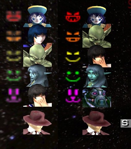 Medals: 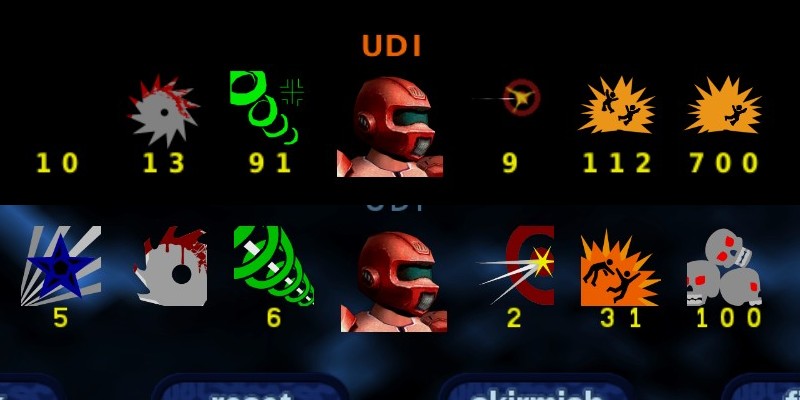 Tournament fonts and items: 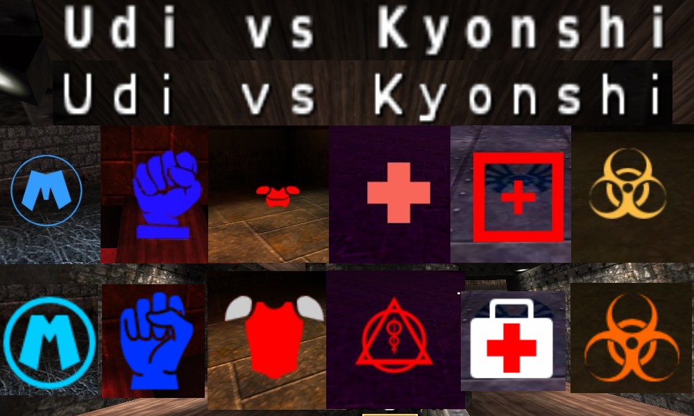 Package: http://udionline.hu/fajlok/z_oa_2d-impr_02.pk3 (make sure you remove every other package which affect medals, fonts etc.) Sources: http://udionline.hu/fajlok/oa_2d-impr_0.2_sources.zipCredits goes to NeonKnight for reviewing the images.
|
|
|
|
« Last Edit: November 01, 2009, 03:17:50 PM by Udi »
|
 Logged
|
|
|
|
|
Marble of Doom
Bigger member
Cakes 4
Posts: 151
Caketastic
|
 |
« Reply #1 on: September 06, 2009, 06:52:08 PM » |
|
I just tried it, and I've got to say it's great! Really love the higher resolution icons, though the blue star doesn't seem to fit for me. Can't wait to see these in the next release
|
|
|
|
|
 Logged
|
|
|
|
chaoticsoldier
Member
Cakes 18
Posts: 375
This space intentionally left blank.
|
 |
« Reply #2 on: September 07, 2009, 01:11:52 AM » |
|
Generally it's a very good improvement, and I have only a few dislikes:
- I like the old medal_excellent more. This is probably just a matter of preference. I still think it's a good image.
- I think medal_gauntlet should have blood on it again.
- The mega health icon is not as bright as before, so it doesn't stand out as much.
- The new chat bubble is too square. Personally, I think the shape of the old one is better.
- The old quad fist looks more powerful/tightly-clenched and symbolizes its power more effectively.
All the rest is great. I especially like the new level_complete images.
|
|
|
|
|
 Logged
|
0101100101101111011101010010011101110110011001010010000001101010011101010111001101110100001000000111011101100001011100110111010001100101011001000010000001111001011011110111010101110010001000000111010001101001011011010110010100101110
|
|
|
cosmo
Member
Cakes 18
Posts: 372
on a dead horse

|
 |
« Reply #3 on: September 07, 2009, 07:56:46 AM » |
|
Nice. See what chaoticsoldier wrote. Check this thread because Schlorri did a few, so get along with him and merge your stuff! Both of you: COMMIT please.  For me there should be more GORE in these icons. Blood on the gauntlet icon is important. The new armorshard does not look recognizable. |
|
|
|
|
 Logged
|
|
|
|
Udi
Member
Cakes 25
Posts: 536
i do my own stunts

|
 |
« Reply #4 on: September 07, 2009, 09:32:04 AM » |
|
Thanks for all the comments  . Really love the higher resolution icons, though the blue star doesn't seem to fit for me.
Technically speaking there are no higher resolution icons in the package, as I mentioned in the first post. Q3 icons are 32x32 pixel large, OA icons are according to the 2 times larger rule: 64x64. BUT! Some icons in the 0.8.1 are even 128x128 large (health icons, armor icons) so I scaled them back down to 64x64. So we save filesize and some memory footprint I guess. The star was just an idea. I was looking for something 'perfect': a circle (but Q3 already has the yin-yang), a diamond or a star. I thought about NeonKnight's checkmark, it would be nice if the end of the checkmark would fade into a weapon or a bone, but the star was easier to draw  . Will work on it. - I like the old medal_excellent more. This is probably just a matter of preference. I still think it's a good image.
- I think medal_gauntlet should have blood on it again.
- The mega health icon is not as bright as before, so it doesn't stand out as much.
- The new chat bubble is too square. Personally, I think the shape of the old one is better.
- The old quad fist looks more powerful/tightly-clenched and symbolizes its power more effectively.
The new medal_excellent is simple, I will add another splash so it's more like a real explosion. The shape of the bodies will be more square, just like the original haste and flight icons. The second body takes up a different position so the medal doesn't look boring, but maybe the mirrored twins represent the double kill more. I was working on the gauntlet blood, but it sucked, so I removed it, but I will work on it. When I made the new bubble I had the new design in mind, but it will take up the form of the old shape again. I will work on the quad icon. Check this thread because Schlorri did a few, so get along with him and merge your stuff! I've already linked that topic in the first paragraph of the initial post, and mentioned there that Schlorri's armor and medkit was used as reference, so they are already merged  . His regen cannot be used, because it is too much Q3ish. And the quad should stay a fist, because the quad model is a fist too. The new armorshard does not look recognizable.
Really? Because the shard icon has now the exact shape as the shard model. |
|
|
|
|
 Logged
|
|
|
|
cosmo
Member
Cakes 18
Posts: 372
on a dead horse

|
 |
« Reply #5 on: September 07, 2009, 06:08:20 PM » |
|
Really? Because the shard icon has now the exact shape as the shard model. Maybe just because of this.  Btw: You did the level difficulty in singleplayer. Nice! Why not using the 'new logo'. See Marble Of Dooms Avatar. Fill it with blood and you're done.  |
|
|
|
|
 Logged
|
|
|
|
|
Marble of Doom
Bigger member
Cakes 4
Posts: 151
Caketastic
|
 |
« Reply #6 on: September 07, 2009, 07:39:18 PM » |
|
Why not using the 'new logo'. See Marble Of Dooms Avatar. I actually just based my avatar on the style Joshua's. I can upload it anyway, if anyone wants to use it. Honestly, I really like my logo better than OA's current one  . |
|
|
|
|
 Logged
|
|
|
|
chaoticsoldier
Member
Cakes 18
Posts: 375
This space intentionally left blank.
|
 |
« Reply #7 on: September 07, 2009, 08:19:29 PM » |
|
Marble of Doom has slightly modified the logo for his avatar. The unedited original version is here. |
|
|
|
|
 Logged
|
0101100101101111011101010010011101110110011001010010000001101010011101010111001101110100001000000111011101100001011100110111010001100101011001000010000001111001011011110111010101110010001000000111010001101001011011010110010100101110
|
|
|
Udi
Member
Cakes 25
Posts: 536
i do my own stunts

|
 |
« Reply #8 on: September 08, 2009, 03:55:00 AM » |
|
The new logo is for a new design and the old logo is for the old design. The 2D improvement pack won't change the old design, because it's an improvement pack for the current release. The new logo and maybe the new font should be released with the new GUI using the Missionpack GUI system. But a new GUI requires a new design concept, if Brett Alton makes the new homepage (he did not posted for a month  ) than it's easier. But finishing a new design would take 2-3 months or more, and if I would commit things which are between the new and the old, than a release would be impossible because of the mixed content. So I stick to the old logo, old font, old design, I can finish the improvement pack in 2-3 weeks, committing and then fromhell can make a 0.8.2 release or just a patch with all the other stuff since 0.8.1 (maps, skins, OA Extended). A 0.8.2 could draw some attention until 0.9.0 is released. |
|
|
|
|
 Logged
|
|
|
|
|
fromhell
|
 |
« Reply #9 on: September 08, 2009, 04:54:32 AM » |
|
The new logo is for a new design and the old logo is for the old design. The 2D improvement pack won't change the old design, because it's an improvement pack for the current release.
Yeah, well i'm not sure if i should commit this anyway since there's also new 2d symbols and things in the SVN. I'm tied and torn between the two! |
|
|
|
|
 Logged
|
asking when OA3 will be done won't get OA3 done. Progress of OA3 currently occurs behind closed doors alone I do not provide technical support either.new code development on github |
|
|
Udi
Member
Cakes 25
Posts: 536
i do my own stunts

|
 |
« Reply #10 on: September 08, 2009, 05:22:21 AM » |
|
Yeah, well i'm not sure if i should commit this anyway since there's also new 2d symbols and things in the SVN.
The last word is yours of course, but I will finish the package anyway, GPLed vector graphics are never a waste of time  . |
|
|
|
|
 Logged
|
|
|
|
Udi
Member
Cakes 25
Posts: 536
i do my own stunts

|
 |
« Reply #11 on: September 13, 2009, 11:48:15 AM » |
|
fromhell, could you make a pk3 with the new blue colored UI scheme please  ? Or should I checkout the SVN and compile it to see what else is changed. I know about Neon Knight's medals, and now the Royal Blue theme, anything else? |
|
|
|
|
 Logged
|
|
|
|
|
fromhell
|
 |
« Reply #12 on: September 13, 2009, 11:24:42 PM » |
|
The blue stuff isn't in the SVN yet since the new VM code does not have my colors yet.
I will make a PK3 though
|
|
|
|
|
 Logged
|
asking when OA3 will be done won't get OA3 done. Progress of OA3 currently occurs behind closed doors alone I do not provide technical support either.new code development on github |
|
|
|
fromhell
|
 |
« Reply #13 on: September 17, 2009, 02:26:31 AM » |
|
Sorry about being late
|
|
|
|
|
 Logged
|
asking when OA3 will be done won't get OA3 done. Progress of OA3 currently occurs behind closed doors alone I do not provide technical support either.new code development on github |
|
|
Udi
Member
Cakes 25
Posts: 536
i do my own stunts

|
 |
« Reply #14 on: September 17, 2009, 03:36:02 AM » |
|
Sorry about being late
Nevermind, thanks a lot  ! The text is still red by me, looking at the modDB screenshot is supposed to be light-blue. I saw you gave the new color values to sago, if the new OAX build will come out with it, than don't bother with a separate pk3. I was asking for the new menu because I put at least three colors into the medals. With the black background and red text it looks ok, but I don't know if it will look cool with the blue background and blue text. Another question is whether the level complete pictures should be grey/red instead white/light-blue. I realized how stupid is to commit images which fit into the old menu to the SVN, so I thought I will focus on new the things instead  . |
|
|
|
|
 Logged
|
|
|
|
Udi
Member
Cakes 25
Posts: 536
i do my own stunts

|
 |
« Reply #15 on: September 17, 2009, 03:29:10 PM » |
|
Here's a fast release so nobody feels blue  ! I've recolored every asset I could find, most of the images are redone in GIMP, some Inkscape drawings and all the menu buttons are generated with Imagemagick through a shell script. And of course fromhell's blue background. Screenshots:Note, that I use jpg files for the title effects because they are smaller in size. Comment if I did wrong.  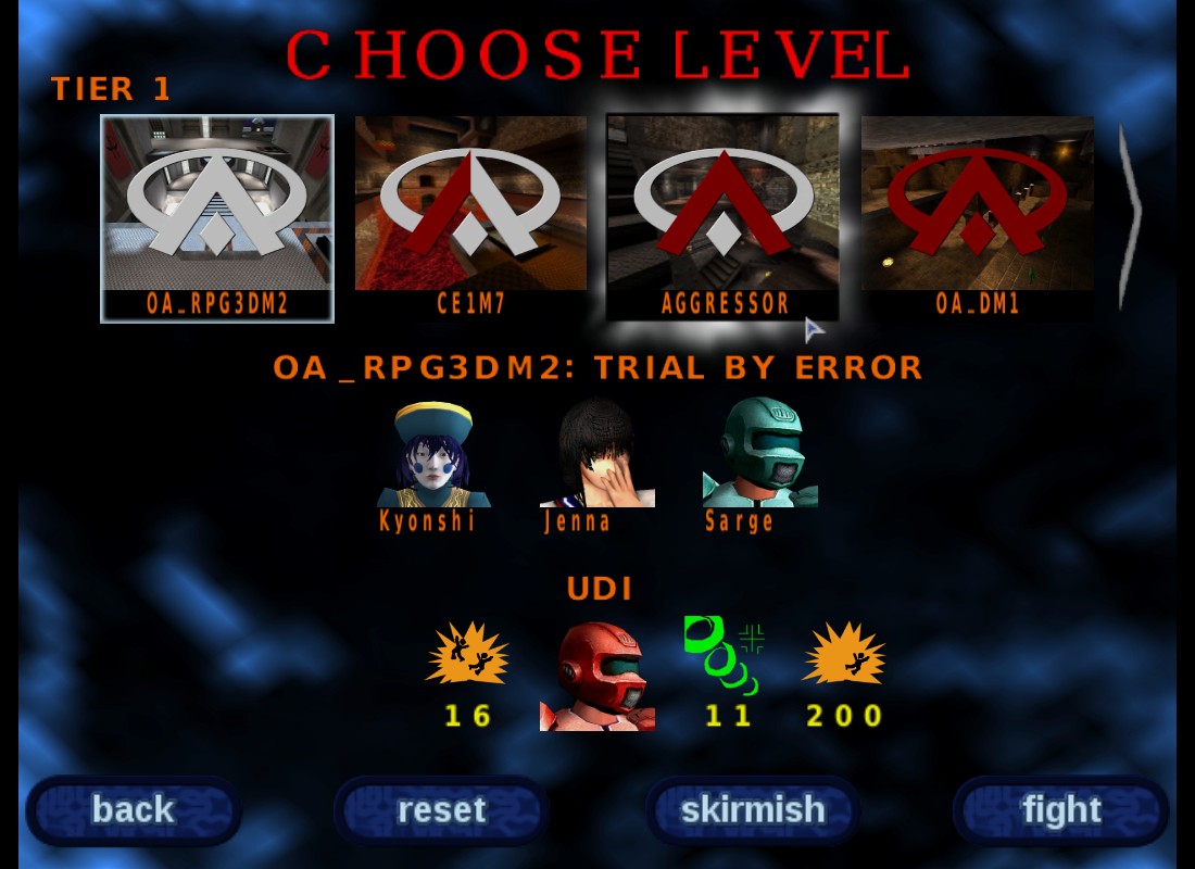 Package: http://udionline.hu/fajlok/z-bluemenu-v2.pk3 Package: http://udionline.hu/fajlok/z-bluemenu-v2.pk3 (don't forget to remove the 2d improvement pack because it contains the old logo) Sources: http://udionline.hu/fajlok/bluemenu-v2_sources.zipLicence: GPLv2 I thought I would merge all these images with the 2d improvement pack when it's next release comes. Or I should leave them separate, dunno how is it easier to handle/commit. Any feedback is welcome as usual  . |
|
|
|
|
 Logged
|
|
|
|
Neon_Knight
In the year 3000
  
Cakes 49
Posts: 3775
Trickster God.
|
 |
« Reply #16 on: September 19, 2009, 06:39:47 AM » |
|
I've made some of the SVN 2D, for example, the health, to make them to have different colors, so they won't be confused with Regen, which is something happening on 0.8.1. But I'll be glad to do teamwork on the entire 2D part as well.  |
|
|
|
|
 Logged
|
 "Detailed" is nice, but if it gets in the way of clarity, it ceases being a nice addition and becomes a problem. - TVT "Detailed" is nice, but if it gets in the way of clarity, it ceases being a nice addition and becomes a problem. - TVT
Want to contribute? Read this. |
|
|
Cacatoes
Banned for leasing own account
Posts a lot

Cakes 73
Posts: 1427
also banned for baiting another to violate rules
|
 |
« Reply #17 on: September 19, 2009, 09:03:08 AM » |
|
Okay, been a few days I try this blue menu. - New buttons (back, skirmish...) look quite good - Background is a nice change too, a bit disturbing at first ; After we wait for some time in setup menus, the screen turns to light blue in most part of the screen, and so it's a bit difficult to read menu items, but it's quite allright. - for the main menu I can say : OpenArena 3D logo has glitches on its leftmost/rightmost parts, it has always been like that even with previous OA versions, I think it leaves an "unclean" feeling (that's one of the first thing you see when you start OA) ; there is also that horizontal split between logo section and menu section. - I don't know if this pk3 brings other changes, except the new logo icons for bring it on/hurt me plenty/... which are nice - Having both red and blue as dominant color may be a bit disturbing too, I felt like 2 different themes were melt, which is the case  but it's okay. Congrats  |
|
|
|
|
 Logged
|
Todo: Walk the cat.
|
|
|
Udi
Member
Cakes 25
Posts: 536
i do my own stunts

|
 |
« Reply #18 on: September 19, 2009, 09:43:33 AM » |
|
I've made some of the SVN 2D, for example, the health, to make them to have different colors, so they won't be confused with Regen, which is something happening on 0.8.1.
I've checked out the iconh_red.tga, so it is orange now. I don't know if changing the color only is a good solution. Because now you have an orange cross in a circle, a red cross in a rectangle and a pink cross. Telling which one is which is still a bit hard. I think if the regen will have the form of the model (big triangle and circle with three little inner circles) and also the medkit will have the form of the needle it can be more distinguished. Or if the needle is too Q3ish, than it can be a medkit pack like in DukeNukem  . But I'll be glad to do teamwork on the entire 2D part as well.  Great idea  ! I will send you a pm about that.
- Background is a nice change too, a bit disturbing at first ; After we wait for some time in setup menus, the screen turns to light blue in most part of the screen, and so it's a bit difficult to read menu items, but it's quite allright.
It seems to happen in the main menu too. I think the problem lies in the sprite definition, it is scaled down more than actually scaled up, so with time the edges will be more visible. - for the main menu I can say : OpenArena 3D logo has glitches on its leftmost/rightmost parts, it has always been like that even with previous OA versions, I think it leaves an "unclean" feeling (that's one of the first thing you see when you start OA) ; there is also that horizontal split between logo section and menu section.
First I thought that the rough line artifacts are generated because the textures have bright pixels on the edges (this bug occurs a lot elsewhere). But no. Even if I make a 2px or 4px black margin it's still there so the effect itself is unclean. I didn't investigate much further into that. The horizontal split is due to a too little mask, the effect would go much lower but it is cut down. As a workaround one can make the glow effect behind the logo smaller so it stays in it's boundaries. But there's a plan to switch to the Team Arena scripted menu system, I don't know if these bugs will be fixed in the old menu. - Having both red and blue as dominant color may be a bit disturbing too, I felt like 2 different themes were melt, which is the case  but it's okay. Yeah, some of the colors are hard coded in the menu, which would need a recompile. I didn't do that, but fromhell has all the proper colors maybe he will make some prettier screenshots. And maybe Sago will release the new colors in the next OAX. |
|
|
|
|
 Logged
|
|
|
|
Neon_Knight
In the year 3000
  
Cakes 49
Posts: 3775
Trickster God.
|
 |
« Reply #19 on: September 21, 2009, 06:34:28 AM » |
|
I've sent you a PM.
|
|
|
|
|
 Logged
|
 "Detailed" is nice, but if it gets in the way of clarity, it ceases being a nice addition and becomes a problem. - TVT "Detailed" is nice, but if it gets in the way of clarity, it ceases being a nice addition and becomes a problem. - TVT
Want to contribute? Read this. |
|
|
Udi
Member
Cakes 25
Posts: 536
i do my own stunts

|
 |
« Reply #20 on: October 25, 2009, 03:26:25 AM » |
|
In the improvement package the skill images (smilies) are drawn with 2d pixel wide lines so they are recognizable, but it's just a workaround. The real problem is, that the r_pic mip value applies to them:  So the real solution is, to make a shader with nopic mip. I've tried to add it, but the HUD doesn't seem to bother about it. Q3 has the same bug(?), so I guess the HUD code lacks that, but I don't have the C knowledge to pinpoint that. Could the shader support for the menu/art/skill[1-5].tga included? Offtopic: why is there a badword filter for pic mip = picmip? |
|
|
|
|
 Logged
|
|
|
|
Udi
Member
Cakes 25
Posts: 536
i do my own stunts

|
 |
« Reply #21 on: November 01, 2009, 03:21:51 PM » |
|
2D improvement pack version 2.0 is released, check the first post for links and screenshots. A lot were changed, thanks for NeonKnight for reviewing them  ! I believe the package reached the SVN quality, I'll post there too, maybe it could come with the 0.8.5, because the package is only 300kb large. |
|
|
|
|
 Logged
|
|
|
|
|
DaywalkeR
Nub
Cakes 0
Posts: 16
|
 |
« Reply #22 on: February 02, 2010, 05:22:38 PM » |
|
Udi, I respect that you work for openarena and your work is good. But I am really angry that schlorri's icons, which are imho better than yours (dont take it personally) get completely ignored in the next release. Here is a link to the topic: http://openarena.ws/board/index.php?topic=3045.0Btw: why did you do an armor with 2 colors? i think this dont improve, it just embarrass the players  |
|
|
|
|
 Logged
|
|
|
|
Udi
Member
Cakes 25
Posts: 536
i do my own stunts

|
 |
« Reply #23 on: February 02, 2010, 09:44:00 PM » |
|
But I am really angry that schlorri's icons, which are imho better than yours (dont take it personally) get completely ignored in the next release.
Those weren't ignored fully, the armors for example have the same shape. As for the two colors, the red armor model has also two colors, and I have introduced more colors on the medals too, so it seemed a good idea to have consistency. As for Schlorri's other icons (regeneration and medkit) they resemble the original Q3 icons too much, so they cannot be used (copyright also covers the design ideas). And Schlorri was mentioned in the release notes too, so he would be never forgotten. |
|
|
|
|
 Logged
|
|
|
|
|
DaywalkeR
Nub
Cakes 0
Posts: 16
|
 |
« Reply #24 on: February 06, 2010, 06:38:16 PM » |
|
As for the two colors, the red armor model has also two colors Sorry, but two colors for the armor arent a good idea. Afair, the aim was to improve, and with that it will just confuse  one-colored armors would be better visible. As for Schlorri's other icons (regeneration and medkit) they resemble the original Q3 icons too much, so they cannot be used (copyright also covers the design ideas) Are you sure? Cpma uses similar icons too, and the maps you can rebuild too. So why should the icons be copyrighted? |
|
|
|
|
 Logged
|
|
|
|
|
